
Nudges, Sludges And Dark Patterns: What Are They And Is There a Middle Ground?
Isobel Madle | 24 October 2024 | 5 mins
In the digital age, psychology is a powerful force that defines every user experience. A strong understanding of human decision-making and behaviour helps designers to develop user-friendly, intuitive products. However, there is also a dark side to this, which manifests in manipulative design techniques, namely dark patterns.
These devices are likely something we have all experienced, in one way or another, from struggling to cancel a costly subscription to feeling stressed when a countdown timer is placed on our check-out basket on an e-commerce site.
But there is the line between clever design that is attuned to user needs and psyches and these irritating, sometimes even manipulative design devices?
In this article, I’ll dive into three types of approaches used in UX design: nudges, sludges and dark patterns. What are they, how do they affect our decisions and is there a middle ground between helping and manipulating users?
What are Nudges, Sludges, and Dark Patterns?
Nudges
Nudges are design elements that steer users towards making a decision that is beneficial to them, either aligned to their own interests or a societal good. In digital design, nudges generally make certain actions easier or more noticeable, without restricting freedom of choice.
There are several examples of nudges such as:
Defaults: pre-selecting an option within the design to make users’ choices easier.
Reminders and prompts: a pop-up reminding users to save their work in an application
They work because, in general, people often stick to the default settings or they are influenced by small cues, especially in digital environments such as e-commerce websites where the amount of choice can be overwhelming.
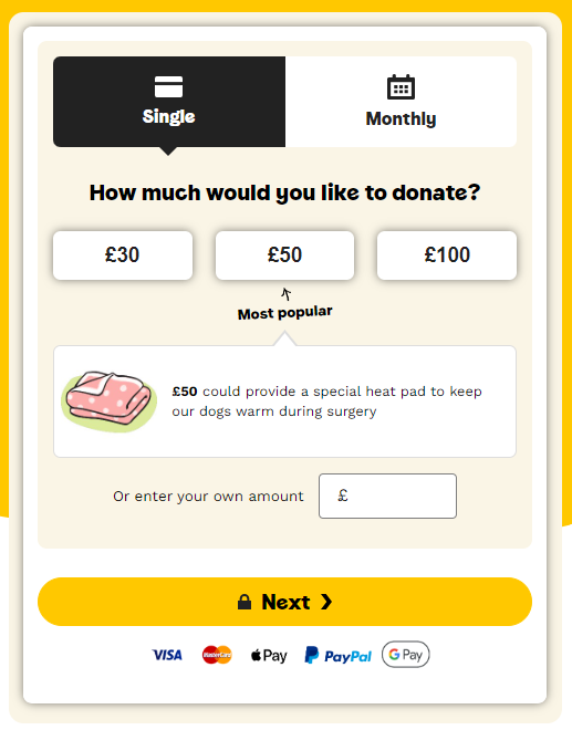
On Dog’s Trust's donation page, a single donation is pre-selected (the default) to make the choice easier for users. They also use social proof by highlighting how much others are donating, encouraging users to do the same.
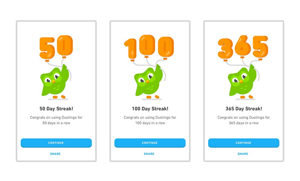
Duolingo can be considered a masterclass in Behavioural Design, with almost every element of the app designed to tap into our underlying biases. For example, Duolingo uses ‘streaks’ to encourage users to play every day to complete a language lesson. Streaks tap into ‘loss aversion’, where people fear losing something more than they desire gaining something.
Sludges
Sludges refer to unnecessary friction or obstacles that make processes harder than they need to be. They are used to dissuade users from completing tasks that may benefit them but could inconvenience a company. Sludges can be a result of poor design choices or intentional to discourage certain behaviours, like cancelling subscriptions.
Examples of sludge include:
Lengthy approval processes: Complicating a process to discourage users from proceeding with an action, such as making it complicated to cancel a subscription.
Burying important information: Often businesses will bury important information into large T&Cs pages, or complicate it with jargon meaning users miss information that they need to be aware of prior to purchasing.
Zoom’s subscription cancellation process is a clear example of sludge. Users are required to complete several steps prior to cancelling:
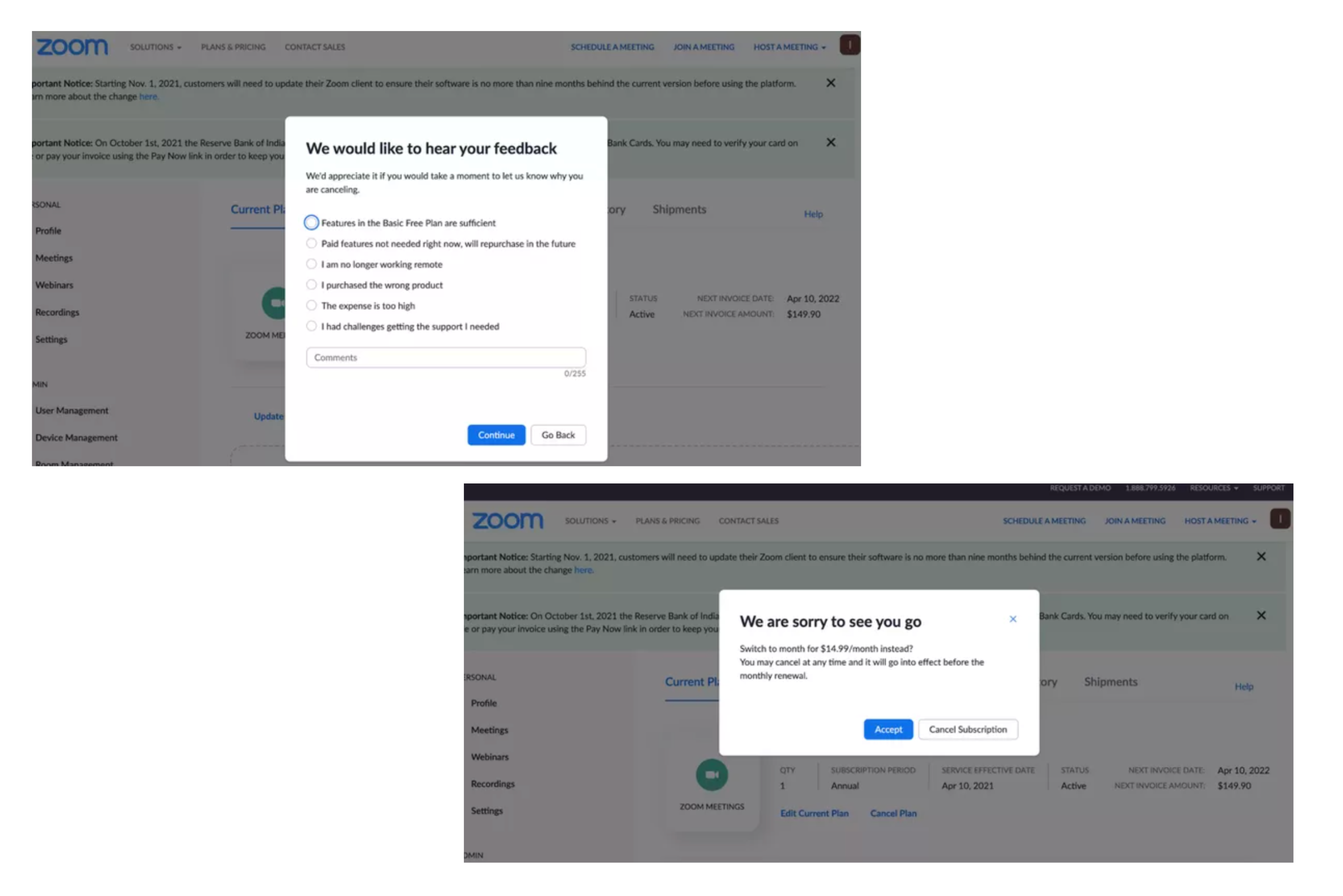
First Zoom asks for feedback on why the user is cancelling their subscription and it is not clear whether the user can skip this step.
Next, they present a counter-offer to keep customers from unsubscribing. Additionally, the ‘Cancel Subscription’ button is deliberately understated in black and white, making it less noticeable.
Dark Patterns
Finally, dark patterns are deceptive techniques intentionally designed to manipulate user behaviour. These devices exploit cognitive biases and user inattention to trick people into taking actions they would not otherwise take, such as purchasing unwanted items, subscribing to things or sharing their data.
Examples of dark patterns include:
Roach Motel: making it easy to sign up for a service but difficult to cancel (i.e. by hiding unsubscribe buttons or forcing users to call to cancel)
Confirm-shaming: using language to guilt users into keeping their subscriptions, for example “Are you sure you want to miss out on all these benefits?”
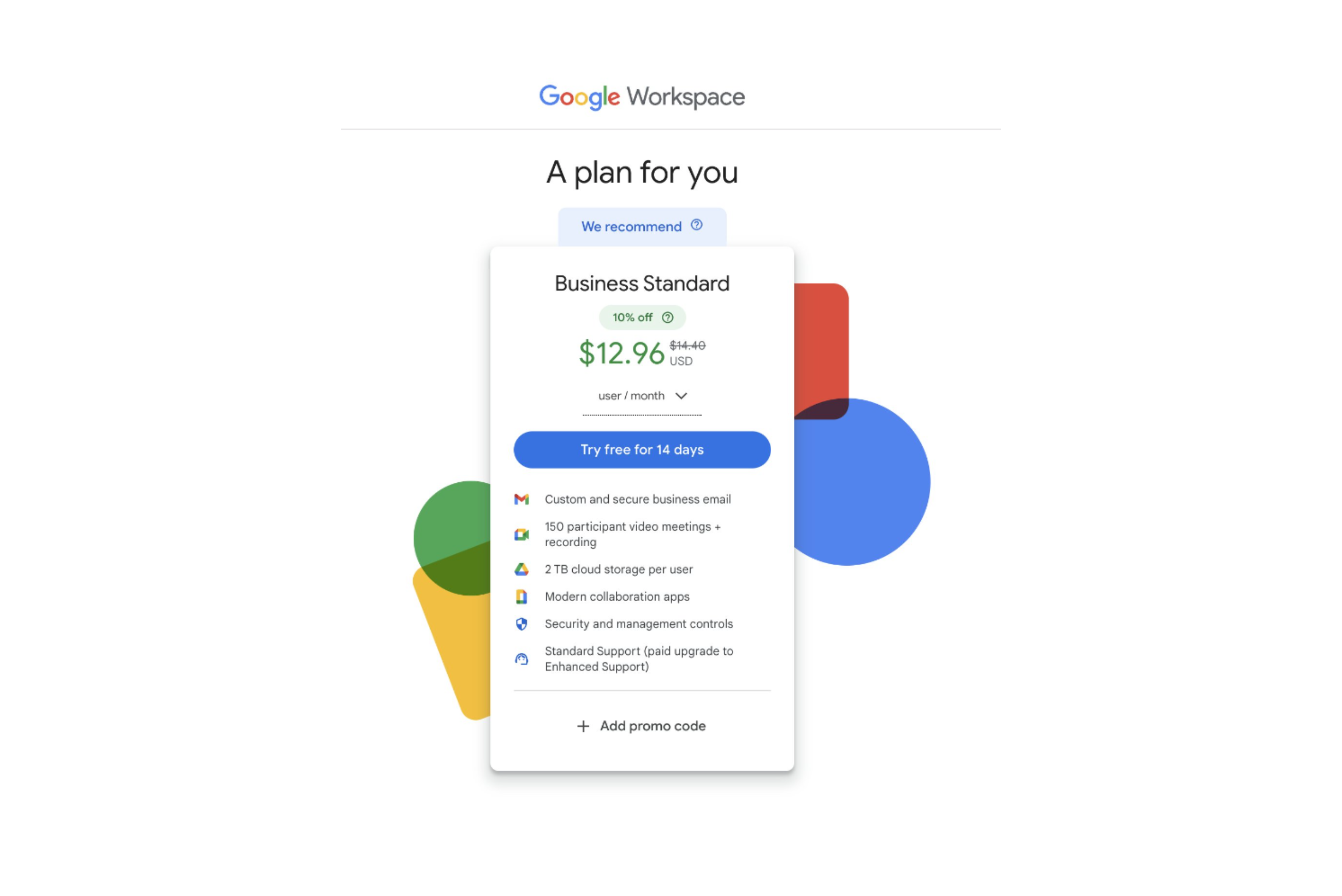
Google's Workspace plan nudges users to sign up for the more expensive subscription free trial first, making it impossible to downgrade to a cheaper option until after signing up.
Is There a Middle Ground?
Given the stark differences between nudges, sludges, and dark patterns, is there a middle ground where designers can balance user benefits with business goals?
Designing with Transparency and Intent: The middle ground lies in designing experiences that are transparent and thoughtful. Of course businesses will want to retain customers, however this should not come at the expense of consumer welfare.
Reducing Sludge Without Sacrificing Business Goals: In some cases, a small amount of friction (or “friction by design”) can be justified. For example, requiring users to confirm actions like deleting an account prevents accidental mistakes. However, this friction should be proportional and not designed to frustrate or mislead users. Businesses can still encourage retention without making the cancellation process overly burdensome.
The Role of Nudges in Ethical Design: Nudges are generally viewed as positive because they align with users’ best interests, helping them make informed decisions. However, even nudges can be misused if not applied transparently. The key is to design nudges that guide users toward beneficial actions without undermining their autonomy.
A campaign by GambleAware appears to promote responsible gambling but its true purpose may have served to improve perceptions of the gambling industry, who profit from this addictive behaviour.
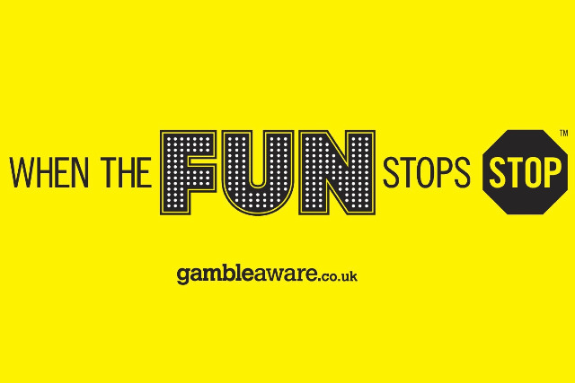
Even the size of the word ‘fun’ compared to ‘stop’ may suggest an alternative intent for this seemingly well-meaning message.
Key Takeaways
Nudges influence users to make better choices for themselves and society, without restricting free will.
Sludges reduce the users ability to make the choices they want to, by adding friction or confusion to the user journey. This can be either intentional or due to poor design.
Dark patterns are intentionally manipulative techniques used to trick users into decisions that will benefit others.
The middle ground in design involves transparency and user empowerment. Businesses can balance their goals with user satisfaction and trust by reducing sludge and avoiding manipulative practice.
However, there are some grey areas where even helpful nudges can be misused. Designers must be mindful of the intent, ensuring that their designs genuinely support user needs rather than merely serving business interests.
By understanding and implementing the differences between nudges, sludges, and dark patterns, businesses can create trust-based relationships with users while achieving their goals without compromising ethical principles.
To learn more about positive design principles, user-centred web designs and combating dark patterns on your site, get in touch, or if you'd like to learn more about nudges, book a meeting.